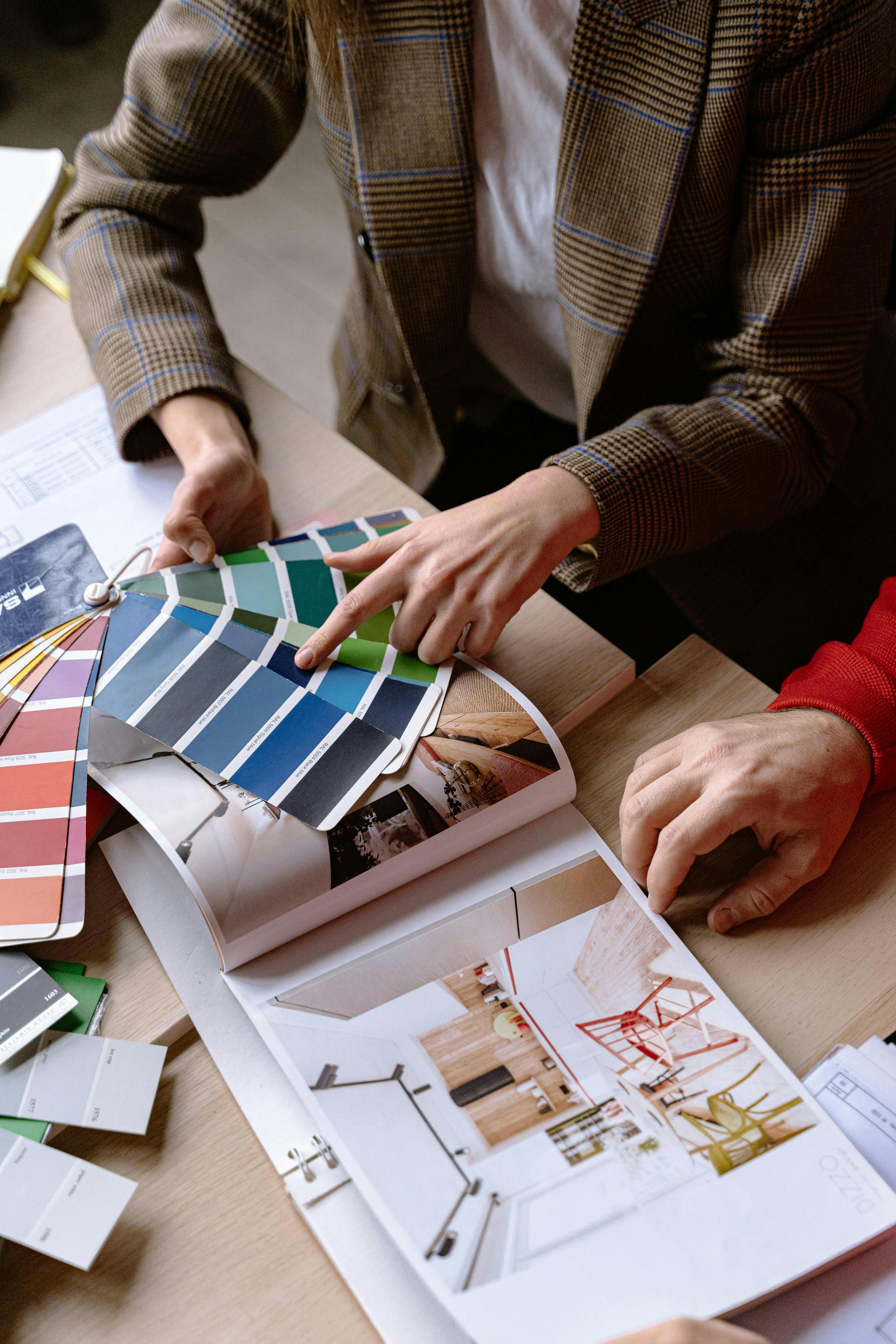
Color Psychology: Choosing the Right Palette
Color psychology is a powerful tool in design, marketing, and personal spaces, influencing mood and behavior. Understanding how colors affect us can help in making informed decisions whether you're rebranding your business, decorating a home, or creating marketing materials. Here’s how you can use color psychology effectively, with insights from both AI and human experts at Mavyn.
Understanding Color Psychology
Color psychology studies how colors impact human behavior and emotions. Different colors evoke different feelings and can have various effects on people depending on their culture, age, and personal preferences. Here’s a quick overview:
- Red: Energy, passion, danger
- Blue: Calmness, serenity, trust
- Yellow: Happiness, optimism, caution
- Green: Nature, growth, stability
- Purple: Luxury, mystery, spirituality
- Orange: Creativity, enthusiasm, warning
- Black: Elegance, sophistication, sadness
- White: Purity, cleanliness, simplicity
Choosing the Right Palette for Your Needs
1. Identify the Purpose
Before selecting a color palette, define what you want to achieve. Are you designing a logo, decorating a room, or planning a marketing campaign? The purpose will guide your color choices.
[Shop Paint Now](https://amzn.to/48OZexc)
2. Consider the Psychological Effects
Each color has different psychological effects. For example, blue can be excellent for a corporate website to evoke professionalism and trust, while yellow might be better for a children’s toy store to convey joy and energy.
3. Use Color Combinations Wisely
Combining colors can either enhance or dilute the psychological impact. A good combination can create balance and harmony. For instance:
- Blue and White: Clean and professional
- Red and Black: Bold and powerful
- Green and Brown: Earthy and natural
4. Test Your Colors
Before finalizing your palette, test how your colors look in different media. Colors can appear differently on screen compared to print. Tools like Adobe Color can help simulate this.
5. Get Feedback
Gather feedback from others to see how they perceive your color choices. This can be particularly useful in avoiding unintended psychological impacts.
6. Consult with Experts
At Mavyn, you can chat with our AI, Mavyn GPT, or connect with a human expert in color psychology. They can provide personalized advice based on your specific needs and goals.
Examples of Effective Color Use
- Branding: Apple uses white for its clean, minimalist design, reflecting simplicity and innovation.
- Interior Design: Hospitals often use light blues and greens to promote a calming atmosphere.
- Marketing Campaigns: Fast food chains frequently use red and yellow to stimulate appetite and attract attention.
Conclusion
Choosing the right color palette is crucial for influencing perception and behavior. By understanding the basics of color psychology and carefully selecting your colors, you can achieve your desired outcomes more effectively. Whether you're a professional designer or just starting out, consider these tips to enhance your projects.
For more personalized advice, remember that Mavyn is here to help. You can explore AI-driven suggestions with Mavyn GPT or connect directly with human experts in the field. Make informed decisions and achieve better results with the right color insights.
